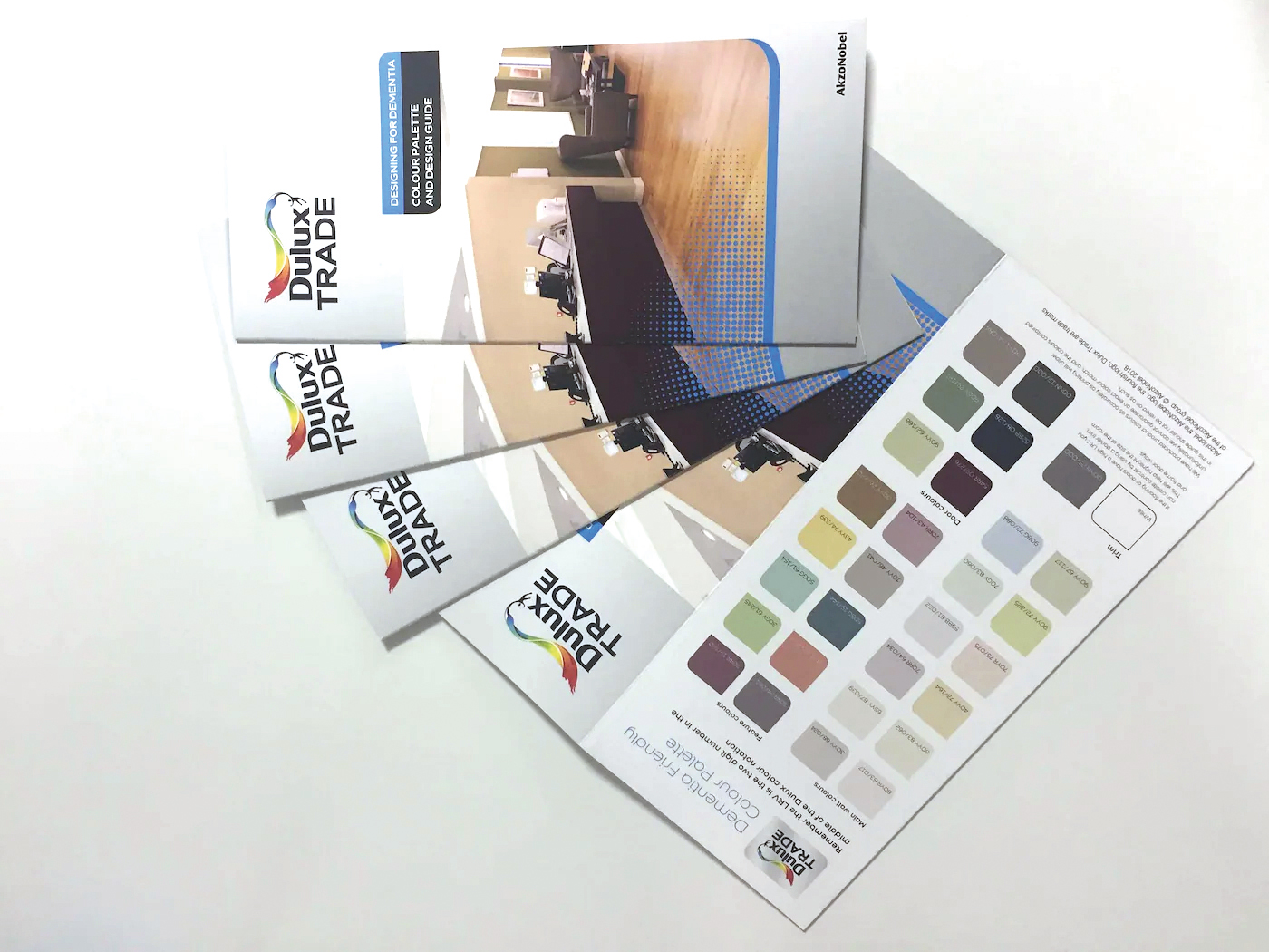
For those living with dementia, the design and colour of a space can have a significantimpact on their independence. In this article, Martha Dunican at Dulux Trade explainshow to create effective environments for those living with dementia, taking insightfrom the company’s Dementia Friendly Colour Palette which has been developed incollaboration with the British Research Establishment (BRE)
According to the National Institute of Aging, dementia can be defined as ‘a loss of cognitive functioning – thinking, remembering and reasoning – to such an extent that it interferes with a person’s daily lives and activities. Statistics from The Alzheimer’s Society show there are currently 850,000 people living with dementia in the UK, with numbers set to rise to over three million by 2051.
SUPPORTING INDEPENDENCE
But there are different types of dementia and symptoms can vary from person to person, so it is important to recognise that memory loss is just one sign. Many dementia patients also experience loss of balance and mobility issues, which are often made worse by poorly designed spaces. To act as a guide for those designing such spaces, Dulux Trade’s Commercial Colour Services team partnered with the British Research Establishment (BRE) to develop a Dementia Friendly Colour Palette, born of a joint mission to bring colour into people’s lives in both a literal and mental sense. The design of the palette draws on a wealth of experience in design and dementia research from collaborations with Loughborough University and Halsall Lloyd Partnerships and is grounded in evidence-based design principles that offer guidance on how to create environments that optimise the wellbeing of those living with dementia.
COLOUR AND CONTRAST
As well as recommendations on the ideal colours to use, Dulux Trade also offers advice on how to best incorporate inclusive design into the spaces utilised by those living with dementia. When designing a space for people with dementia, it’s important to consider how the symptoms of their condition can impact the way colours and spaces are perceived. Up to 75% of people over the age of 75 will have vision problems as ageing eyes become opaquer, causing colours to be ‘washed out’ and making it harder to differentiate between various substrates. Building and interior designers can compensate for these sight deficiencies by choosing slightly strong colours and ensuring there is clear differentiation between neighbouring surfaces and objects.
FINDING YOUR WAY
A report by Reading University in 2004 – Colour, Contrast and Perception: A Design Guidance for Internal Built Environments
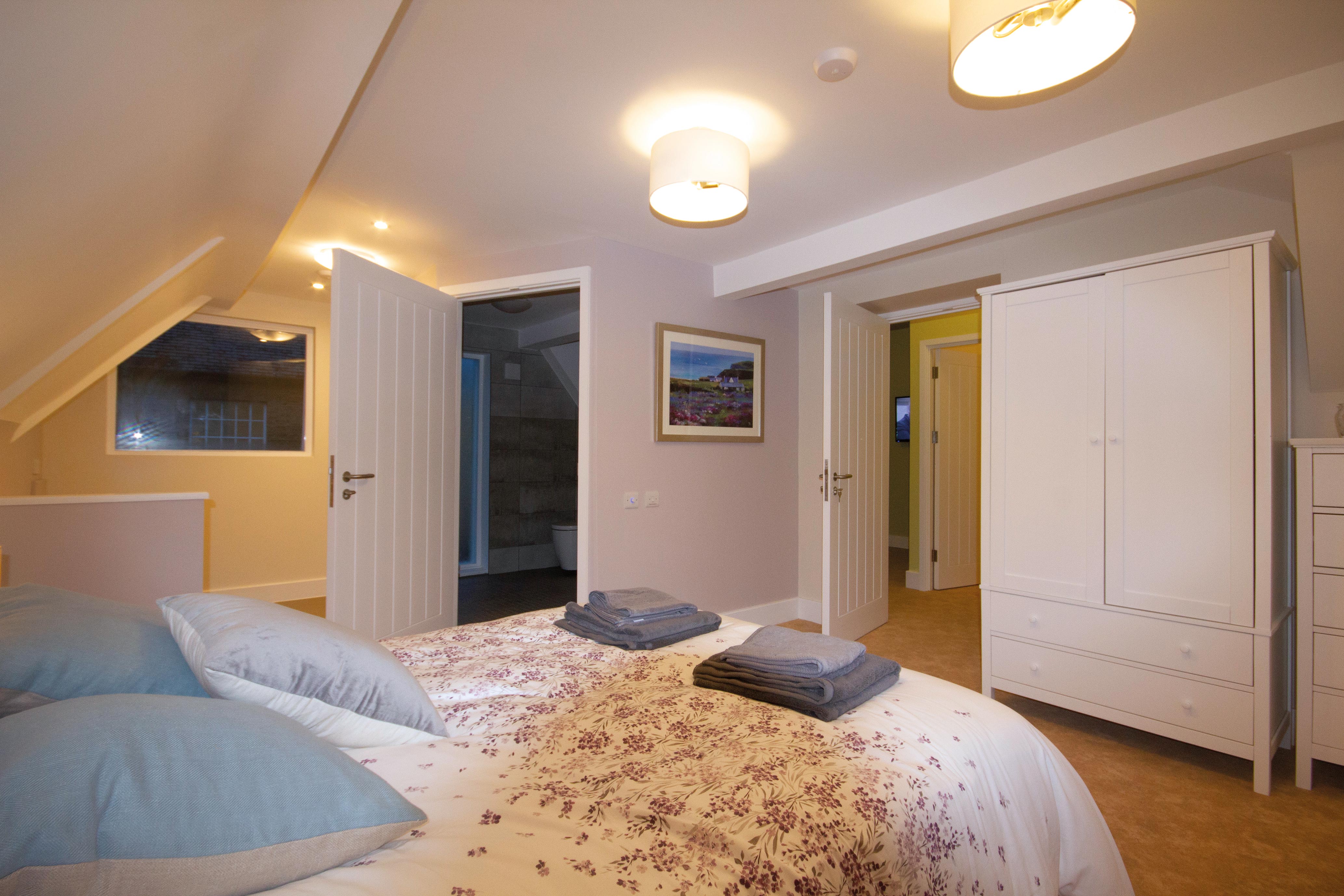
– discerned that if you have the contrast of colour right between critical surfaces, it will aid people’s navigation around that environment. Critical surfaces are the most important elements in gathering information and understanding a space and the principal surfaces are walls, floors, doors, and ceilings. As a guide it is helpful to use the 30-point Light reflectance value (LRV) as recommended in British Standard BS8300-2. It is essential that the ceiling is painted in a contrasting colour to the walls to help establish where one surface stops and the other begins, thus helping people with dementia to establish the size and shape of the room. As people begin to walk through the room, they then look at the walls and the floor to guide them through that space, so there is a need for these surfaces to also contrast. To eventually exit a room, people look for doors – and again, it is important for the doors to differ in colour to the floor and walls to help people locate them.
HAZARD WARNINGS
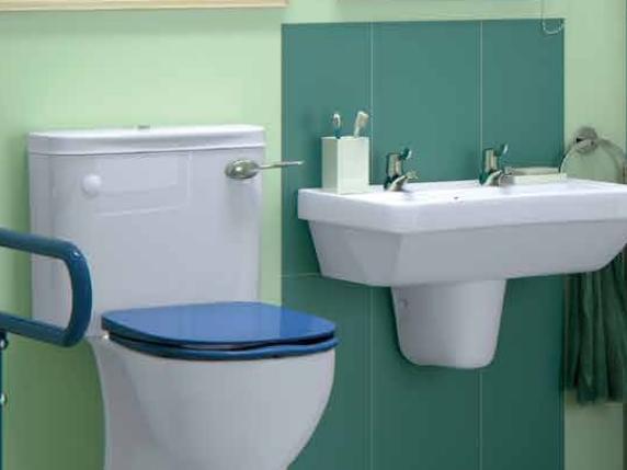
Consideration should also be given to how contrast is used to highlight key features and potential hazard points. Handrails, when installed, should contrast with the wall and include a feature to indicate where they end, such as a knob or the rail turning inwards. Stair nose edging must have contrast, too, and radiators should be highlighted due to the risk of scalding. Other key areas are alarm panels, sanitaryware, and furniture. If involved in the specification of furnishings, remember that colour and contrast are important considerations still, so make sure that the furniture has an adequate colour contrast to the floor and other surroundings.
HITTING A WALL
The Dementia Friendly Colour Palette recommends soft neutrals for main wall colours, with only small hints of colour to create a sense of calm. This also makes it easier to differentiate main walls from other aspects of a room. For example, as well as helping to stablish the size of a space, using contrasting colours can act as a visual prompt and create focal points for those living with dementia when wayfinding. If the end of a corridor is a different colour to the corridor walls, patients can see their route more clearly. These feature walls are best distinguished by a pop of colour to contrast with neutral main walls, with yellows, muted purples, peaches, and teals being prevalent recommendations within the palette. It is also worth having different colours on different storeys of a building so residents can recognise what level they are on. Similarly, it’s important to differentiate between rooms, using contrasting colours to help indicate the purpose of the space. For example, painting the living area a different colour to the kitchen to visually zone these areas.

A SIGN OF THE TIMES
What’s more, signage can be made more visible by having a feature colour behind it, and painting radiators, light switches, and handles a different colour helps residents quickly identify these objects and their purpose. In addition to this, for many, dementia can affect their biological clock so including calmer colours in the bedroom area – such as the neutral main wall tones in the Dementia Friendly Colour Palette – using blackout blinds, and incorporating softer golden lighting helps to instil a sense of calm and relaxation and encourages a more stable sleep routine.
OPENING DOORS
To increase visibility and make doors easily identifiable, the whole door and architrave should contrast visually with the surrounding surfaces. The leading edge of the door should also have some contrast against the wall or background when it is opened. In contrast, when painting the doors of ‘staff only’ areas consider using the same colour as the walls so as not to
highlight the door and to discourage use by dementia patients. Opting for bolder shades such as navies, sage greens, and burgundies will help to make doors more visible and easier to locate. And, when designing bedrooms, it is important to make the space resonate with the individual to bring a sense of homeliness and inspire memories. Painting the front door to their bedroom in the same colour as the front door of the occupant’s childhood home and including something personal to them on the shelving outside, such as photographs or an old house number, can help them to easily recognise that the space is theirs. Painting bathroom doors a different colour to the walls is also beneficial as it makes the door quickly identifiable and helps to reduce incontinence. When it comes to flooring, it’s important to avoid high sheens, patterns, and stripes as highly sheened flooring can look slippery, and bold patterns and stripes can make them feel the floor is uneven or unstable. A high contrast between the flooring from one room to another – for example, a bedroom to an ensuite bathroom – can also cause confusion for the occupant. This is especially true with darker flooring as patients can perceive this as a hole.
LIGHTING THE WAY
Finally, keeping lighting levels consistent throughout rooms is crucial, as shadowing and glare can be confusing and disorientating to those living with dementia. All the elements mentioned work to keep a space occupiable for residents with dementia and help them maintain their independence. But nothing endorses their independence more than their control and choice over the design. Taking residents’ likes and dislikes into account gives them ownership over the space and Dulux Trade encourages those designing these spaces to speak with residents to establish what they would like to see in their environment. It is vital to be sensitive to their memories, stories, and preferences, while also considering the crucial design features that make the space liveable.